Skeleton Screens for Better Loading in React
Skeleton loading is a surprisingly easy and impactful way to improve user experience. In this post, we’ll share a real-life example and our own React proof of concept to get you started.

What you’ll find in this article:
- How skeleton screens improve user perception and usability
- How we implemented skeletons in our projects
- Our React-based proof of concept
A Bit of Context: What are Skeleton Screens?
Skeleton screens are an effective tool to keep users engaged while web pages are loading, and they’ve become a best practice for the Whitespectre development team. So what are they, exactly?
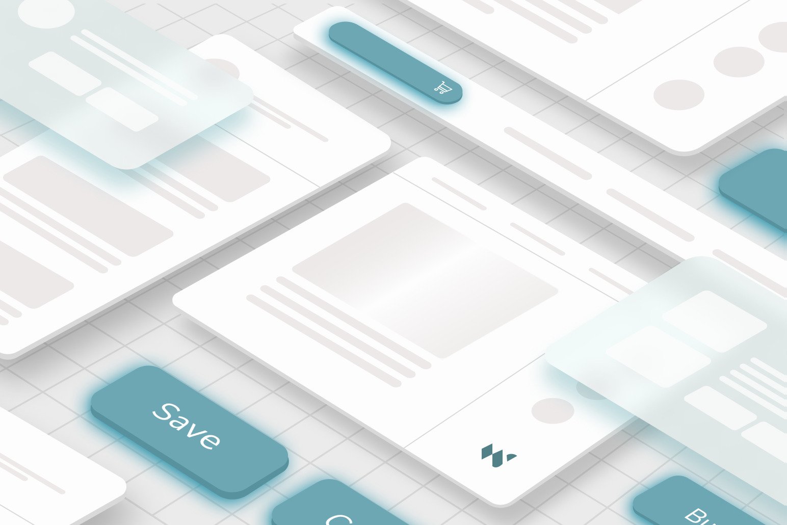
They consist of blank pages with grey or neutrally colored shapes in place of elements that are still pending for data to be loaded. As the page data loads, those placeholders get replaced by the actual content, completing the illusion of continuity. Today, most top tier applications use them, so you’ve probably seen them on Youtube, Facebook, or LinkedIn.
Unlike explicit loading experiences such as progress bars, spinners or splash screens, skeletons have a significant benefit: they look like the actual content. This gives the user information about the context of the data before it loads, and more importantly, draws the attention away from the indicator, i.e. the thing that makes the user focus on loading time.
Quoting Luke Wroblewski, which first introduced the “skeleton screen” concept:
“We had made people watch the clock. As a result, time went slower and so did our app”

Perceived time can matter a lot- especially when you’re looking to retain or convert users. It’s been proven that slow load times raise abandonment rates and that they are the primary reason visitors abandon a checkout process in e-commerce applications. In summary, improving loading time perception is not only about creating a ‘nicer’ user experience, but potentially improving conversion rates too.
In addition, with skeleton screens, the parts of the application that depend on different network requests can gradually load, and those that don’t depend on the data, like menu links, are ready to use from the start. So skeleton screens also improve usability– they’re not just a neat trick to hack the human perception of time.
How Whitespectre implements Skeleton Loading for React
So how do we actually implement skeleton loading at Whitespectre? Here’s an example: We have a large meal delivery client with a highly custom front-end experience and feature set. For several years, they had a server side rendered Rails application that worked well for them. However, as the company expanded their offerings and feature set, and overall ‘upped the game’ on user experience, a more dynamic client side rendered application was a better fit. That’s when we started migrating it to React.
TL;DR: migration to React was a great idea. Now, we were able to more easily deliver the level of customization and slicker user experiences for the company’s next phase. But we quickly noticed that before booting, the React application showed a blank screen for a fraction of a second that disrupted the smoothness of the experience.
This, unfortunately, is inherent to client-side rendered sites. Before JavaScript applications hit the web, web servers returned HTML in response to HTTP requests. But now, many serve full blown JavaScript applications that render themselves in the browser, so they have to be downloaded and fetch data before they start rendering.
The product team’s initial idea for a solution was to implement a loading spinner, thinking that was the easiest path. However, we reviewed skeletons as a better and mostly equal effort solution dev-wise. Soon, everyone saw the benefits of this quick win.
Your turn: How to Get Started with Skeleton Screens
Note: We use React for our proof of concept, as it is the most popular library in the frontend development space right now, but styling and principles apply to whatever library or framework you choose.
Firstly, take a look at this useful library: react-loading-skeleton. It’s easy to put up simple skeleton states with it:
import Skeleton from 'react-loading-skeleton';
import 'react-loading-skeleton/dist/skeleton.css';

<Skeleton count={5} />
If you need more complex skeletons, it’s also possible to craft them yourself. Here’s an example:
The skeletons.css file has the basic styles, inspired by those in
react-loading-skeleton. You can reuse that one, since use case specific styles are in
styles.css. In JSX, just use c-skeleton-line, c-skeleton-square and
c-skeleton-circle classes as you want, and try to reuse as many as your existing CSS layout and
item styles. Feel free to use it as inspiration!
Here are some things to keep in mind:
- Avoid blocking gradual content loads, or the result won’t be much better than a splash screen.
- Tuning animation timing and effects (such as a pulse or wave effect) can further improve the loading time perception.
- Very short loading periods, (e.g., below 300ms) won’t benefit much from skeleton screens.
- Really long loading periods are not the best fit either: If the task takes, for example, 10 seconds to complete, the user would probably rather see an explicit progress indicator.
Thanks for reading to the end! If you liked this post, follow us on @whitespectrehq or LinkedIn. Also, feel free to ping me on Twitter at @enekodev. All feedback is welcome – let’s continue the conversation!
